Providence artist Jacen Burrows generously offered to respond to reader questions, so we have hosted this “Ask the Artist” interview. Reader questions were submitted in the form of comments on this post. Facts Providence edited, expanded, combined, and re-wrote questions. Burrows gave revealing and insightful answers. We added some links and images, and grouped the content into some broad themes: Lovecraft, Providence details, working with Alan Moore, covers and more.
BURROWS ON LOVECRAFT
Which is your favorite Lovecraft story, and why?
“Cool Air” was the first I read so it always has a nostalgic feel, but I really love At the Mountains of Madness. The isolated setting and the horrific discoveries all struck a chord with me. I think it was the first story I read that gave me that classic Lovecraft chill of realizing mankind’s inconsequential nature amid the vast cosmic unknown. I was a 14-year-old punk nihilist suburb kid when I read it and it felt like it was a perfectly reasonable world view.
How closely do you try to match Lovecraft’s original descriptions for his characters? For example, your interpretation of Dr. Alvarez/Muñoz seems essentially identical to Lovecraft’s description, whereas Increase Orne (the Terrible Old Man) is missing the long white beard which Lovecraft focuses on. Do you allow yourself much leeway when it comes to breaking continuity from Lovecraft’s stories? Do differences emerge from Moore or from you?
That was all script-based. I tried to remove all preconceived notions of these characters from my mind since the way our story was set up, ours are just sort of the templates for what Lovecraft would later write. That gives us some extra leeway. But he was rarely very descriptive of his characters and creatures anyway. I think we got the spirit of them right.
Considering the relevance of the literary work of H. P. Lovecraft for the Providence comic, what do you think about the World Fantasy Awards dropping Lovecraft’s image on their prize after some controversy emerged after Lovecraft’s racism?
I think it makes sense. HPL represents a lot of wonderful things about sci-fi, horror, and the pulp origins of the genre but a lot of his ugly, controversial views can’t be ignored. If it was an award specific to him and his legacy, something like an “H.P. Lovecraft Award for Weird Fiction” or something, I think it would be perfectly natural to have his image and I would expect his controversial nature would be explored and discussed. But this an award for the best fantasy fiction of the year which is a much broader range of material. I can understand why it felt wrong for many.
THE COURTYARD THROUGH NEONOMICON THROUGH PROVIDENCE

Are there any more pages of alternate artwork for Neonomicon or Providence? There was an alternate ending to The Courtyard, with one of your pages published in The Courtyard Companion. Does Moore often come back with changes to scripts?
The original last page of The Courtyard was deemed a little too hardcore and out of tone for the story, which I agreed with. That kind of splatter gore wasn’t the right fit.
The only other page I can remember redoing at Alan’s behest was the [Letitia Wheatley point-of-view image of Garland Wheatley and Yog-Sothoth] splash page from Providence #4. The first version lacked some visual punch and I had drawn the old man with his eyes closed for some reason. The script had called for them to be open, I just missed that detail while trying to work quickly. The second version zoomed in a bit and was just generally better.
We’ve done edits of minor things in different panels here and there, but that was the only redraw.
He hasn’t actually changed anything from the scripts. By the time they’ve gotten to me they are pretty thoroughly finalized.
It seems like there is a black cat in nearly every issue of Providence and Neonomicon – and they are part of Lovecraft history and stories, too. Are you a cat person? Were all these cats in Moore’s script, or were any of them your idea? Were any of the cats you drew covered up by the lettering so we missed them?

Yeah, I have hidden a cat in every issue of Providence and Neonomicon somewhere. As I recall there was one in an issue of Neonomicon that was covered and one covered in issue #2 of Providence. He’s on page 4, panel 1 in the window on the right.
That was my own little contribution.

I had read about Lovecraft having a small black cat of his own, I think there is even a picture of him with it.
I have always owned cats myself, including my current cat, Dinah, a big fluffy black cat. My thinking was that it would be a fun little “where’s Waldo” thing for the observant types but I wasn’t sure anyone would even notice. I also thought that it might serve as an avatar of Bastet, watching things unfold from a distance.
One of the Book of the Dead covers for Neonomicon was Bastet themed and I enjoyed playing up that cat angle. I liked the idea of the Cat Goddess watching history happen but I didn’t want to make it too overt since it wasn’t from Alan.
In Neonomicon I also attempted to hide a small five-pointed star on just about every page. Sometimes a badge, sometimes a shadow in a brick, sometimes, like on the 2nd page, a leaf in the dead center of the page.
We had worked out a tentacled star icon for the series and it was just something fun for me to do. It didn’t have any meaning and I don’t even recall if I followed through with it through all 4 issues.
When you are doing remarqued hand-drawings, such as Neonomicon #1 Retailer Incentive cover, is it an enjoyable process? What is your state of mind while drawing 250 similar pieces in a row?

I tend to spread them out so I may only do 10-15 a day. There is a stress that comes from knowing I have to do so many, but it is balanced with knowing that they are just sketches and I can be a bit looser and more spontaneous. And I do like making up versions of C’thulhu quite a bit.
The portrayals in Neonomicon and Providence seem to be slightly different from The Courtyard, especially concerning characters’ features, which seem to be a bit less detailed and less angular. Is that just because your style has changed, or are there some other reasons?
It is just a matter of evolving as an artist. I was still working a lot of stuff out stylistically and in terms of ability. And the tall, two-panel grid format really made things difficult as well. I had to attempt angles I wasn’t really capable of yet. But if you are comfortable with what you are doing, you aren’t going to get better.
PROVIDENCE DETAILS
Which Providence panels, sections, and/or covers are you most proud of?
I really liked the Lilith chase in issue #2. I liked playing with the extreme darkness.
Or the nightmare sequence in issue #5 because I think it was genuinely creepy.
But my favorite single panel might be the shot of Robert in front of the Wheatley house with its sense of foreboding danger.
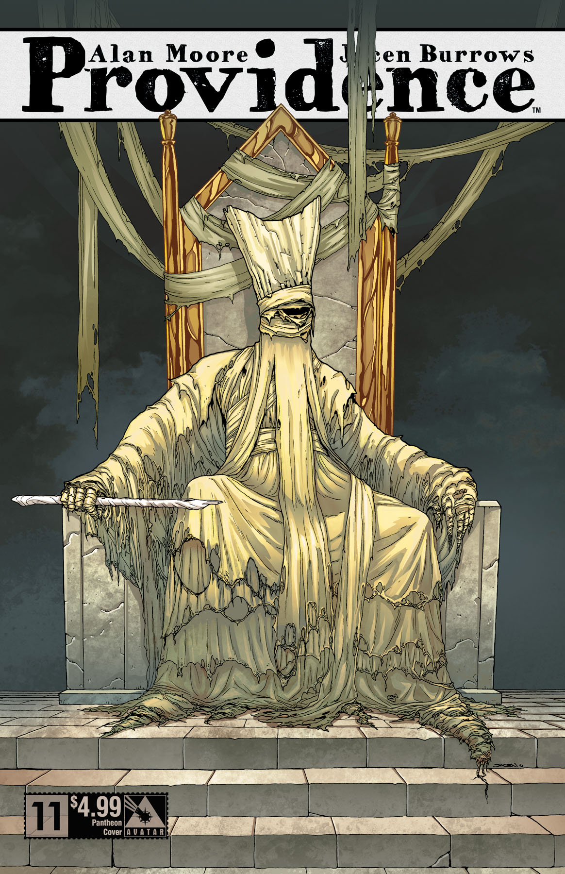
I’m really pleased with the issue #11 Pantheon cover which is still to come.

What was the single most difficult panel and/or page you had to illustrate in Providence?
The issue #3 splash page with the writer’s strike was certainly the most detailed. It took most of a week to finish.
Issues #9 and #10 both had to be drawn very fast which is a different kind of difficult. You have to sacrifice detail in spots in order to give others the emphasis they deserve and sometimes you have to let something like a wonky figure or face get by you in order to keep your momentum. But I wasn’t given the kind of time I had on the early stuff and ultimately you have to stick to the publisher’s schedule.
On average, considering you are both the penciller and inker on a given project, how long does it take you to create a page? Do you ever have to restart from scratch due to a glaring and un-fixable mistake?
In the digital age a lot of mistakes can be fixed in Photoshop later. Aside from the aforementioned redrawn spread from issue #4, nothing but a few tweaks had to be done here and there.
I generally can do three pages a week of high detail comfortably. Four or five in a pinch but the quality takes a hit. Really detailed stuff can take up to four days though. I think the pages in Suydam’s parlor, for example, were all very slow. All those books and furniture!

Can you elaborate on your process for illustrating #5’s Witch House? Is there any particular weird detail of it that you are especially proud of?
Alan had described the style he wanted pretty clearly and the trick roof was intentional. It was meant to be fairly subliminal initially.
The script mentions a single panel cartoon drawn by the daughter of Dirk Mosig of a psychologist analyzing H.P. Lovecraft. In that cartoon, on the wall in the background is a tiny framed picture of a house with the same roof effect.
That’s the kind of tiny detail Alan is capable of recalling. He had a copy of that picture sent along with the script. I’m not even sure what you would have to Google to find that!
Describe the process of designing Lovecraft’s various non-human creatures for this project? Were some easier to conceptualize visually than others? How much of this does Moore specify vs. what you come up with?

The ones that appear inside the issues are all pretty well described. At the very least, Alan leads the direction he has in mind with a reference.
For example, for Wilbur Wheatley he specified that his mental image came from the classic Dunwich Horror cover illustration by Lee Brown Coye: the ill-fitting suit, the wild hair. For the face we discussed getting a bit more goat in there but it was a solid start.
For the ghouls, I did several rounds of sketches. Some were very dog-like. But we got to a pretty solid design for King George. The photoshoot was before I got to that issue so I was able to make tweaks to the design to be consistent with the makeup design, too. The original was a bit more snouty but I liked what they did a lot.
The Pantheon and Dreamlands covers were pretty much all my designs except the ones that appear inside the issues like the tentacle-faced train conductor monsters.
Sometimes I’d reread the stories or listen to audio-books while drawing and do sketches until something felt interesting. Designing monsters is pretty much the most fun thing an artist can do.
One remarkable thing throughout Providence, Neonomicon and The Courtyard has been your portrayals of the menagerie of various flora and fauna. Is there any chance of a collected volume or original collection of these? Do you have character design images independent of what appears in the comics and on the covers?
I do a lot of very small, mostly unreadable thumbnails but mostly I flesh out the drawing on the page so I don’t have much to show in the way of preliminary art.
I’m not sure if Avatar would ever bother with a collection of just covers. I tried to suggest that once for Crossed after I had done so many that I lost track, but it never happened. They did put out a card collection at one point, though. That was kind of amusing, having all of the nasty Crossed atrocities on a baseball cards, but I don’t think it sold very much.
I suspect they have plans to package Neonomicon/Providence a bunch of ways in the future: softback, hardback, individual trades, maybe a big hardback omnibus. Maybe even one of those giant “Absolute” editions. But I imagine there will be a version that has most, if not all, of the related art at some point.
Clearly Moore heavily researched Lovecraft’s work in preparation for Providence. But, can you tell us some or all of the books, fashion, period art styles, etc. that you’ve researched for Providence references? How do you go about researching sites, locales, bridges?
I got pretty good at scouring the internet for information. I had help from Alan’s camp as well as Ariana Osborne at Avatar, who was able to find a bunch of things I couldn’t. A lot of stuff doesn’t show up in Google or Bing searches but you can find stuff at library sites, historical archives, individual city archives, etc.
Offline, I bought quite a few fashion books that consisted mostly of catalog illustrations from the era, and several books about the culture of the time. Unfortunately, there is an awful lot about World War I and the Roaring 20’s, but a lot less about the post-war era.
I also dug into as many movies and TV shows about the era as I could – just to get a feel for people walking and talking in those clothes and settings. Most of those I wouldn’t reference exactly since I couldn’t be sure of their accuracy but they were good for getting me in the mindset. Things like Boardwalk Empire and the early bits of Once Upon a Time in America, for example. And some [Charlie] Chaplin and other period films.
Two major characteristics of Providence are intense architectural detail, and long dialogue scenes. Has there been a visual connection between those two things? Do you feel like the book’s emphasis on architecture has affected how you draw the characters’ expressions and body language?
I suppose. When you have a ton of architectural detail, things can get a bit lifeless with all of those ruler lines and repetition of forms so I try to balance it with organic things like plant life, trees, animals and people. The people also tend to be kind of stiff in those classic three-piece suits and straight line dresses but you can add organic lines with wrinkles and the limited exposed anatomy.
I’ve always tried to have fairly animated expressions on my characters. It felt all the more important with this series to give a bit of dynamism to what is otherwise a generally stoic depiction of people doing less than exciting things. I also tried to keep things from getting too cartoonish since it wouldn’t fit the tone. It is a balancing act.
There are detailed wallpapers in many interior scenes of Providence. Many of them have different colors and patterns. Did you design them with a particular objective? Did you research early 20th century wallpaper design? Rugs, too. How did you design Randall Carver’s rug in Providence #8?
One of the decorative elements that Alan mentioned frequently is scripts was the old fashioned printed wallpaper. It is definitely a big feature of the time period.
I seem to recall early on that we found a website with images of wallpaper patterns to reference but I don’t think we used those exactly. I’m not 100% sure if it was the colorist or production people at Avatar who made or found the designs that did get used.
For the rug, I found a few images of detailed Persian rugs online and essentially said “something like this”. Again, not really sure who did what there. An image was laid in using Photoshop to skew and stretch it into shape. I was worried that it would look awful, honestly, as that can sometimes be jarring, but I was pretty happy with what they came up with.
In Providence the line between fiction and reality tends to be pretty blurry. Have you – as the artist – perhaps had any strange experiences where elements of the story mysteriously seemed to find their way into your own life?
I’ve always had weird dreams but they have been weirder at times during this project, certainly. But I chalk that up to deadlines more than anything.
One odd story, though. When I was in Northampton the first time and we were walking around getting shown the sights I spotted a one-legged crow three or four times in different locations. Maybe the crows of North Hampton have a tendency to lose feet or maybe it was the same one I kept spotting. It definitely felt worth noting at the time and added some weirdness to what was already a surreal experience for me.
Panelwise, what is up with the yellow border around some “dream”/unreality panels, including the underground sequence in Providence #2? Is it purely to define the borders of a dark panel, or is there a specific thematic reason? Is this your choice or did Moore specify the yellow panel border?
Yeah, those panels were using such heavy shadows that without borders I didn’t think they would read as three clearly separated vertical panels per page. It just made sense to give them a defined border so the storytelling would be clear.
As for the yellow, that was either the colorist or maybe Alan made the suggestion after getting his proofs. I’m not sure.
PROVIDENCE COVERS
Could you elaborate at all on the Pantheon variant covers? What is your process in bringing those various unimaginable beings to life? Could you speak at all to the relevance of each issue’s god/monster to the subject matter contained within? This may be Moore’s territory, but, for covers, does he simply give you an entity’s name and let you run wild, or is he more specific?
Basically, early on Providence was going to be a 10 issue series. Alan was working from an outline he’d made of what Lovecraft stories would be explored when and where, so I was given an incomplete list of cover subjects. The list would basically just have the location, character or creature name but not anything else so I was free to explore and try things.
With the early covers, I was able to actually show Alan thumbnails and we discussed options in person.
Once the series was expanded, there was some shuffling of covers but some were probably already solicited (they do that long in advance) so some might not have corresponded directly with the issue as well as was intended. With so many variants to do, it was less of a priority to get them all to 100% lined up.
I got a finalized list of covers just a few months back and have just recently finished all of the covers. At least until it is time to do collections.

What is that toad on the Providence #6 Pantheon variant cover?
That was indeed Tsathoggua. I focused more on the toad qualities than the bat ones. I figured all of the gods can probably alter their appearances as need be, sliding from one aspect to another.
He was furry when I first penciled him and it looked kind of goofy so I went with toad skin to make a more interesting texture.

Who is on Providence #9 Women of HPL variant cover? There are two theories: H.P. Lovecraft’s mother or Crawford Tillinghast’s housekeeper in “From Beyond”. Which is correct, if any?
That is Lovecraft’s mother. It is quite a few years after the only known photos of her I could find so I had to extrapolate a bit making her harder to recognize.
Just to head off future confusion, Lovecraft’s wife appears on a later cover although she isn’t in the story. She’s a bit obscured and I know it will probably be a little confusing so I figured I’d mention it.
WORKING WITH ALAN MOORE
It’s been said before that Alan Moore really gets the best out of his artists. Would you say working with Moore has had any impact on your art style in any way? If so, how?
I’ve had steady growth over the years from project to project. The kinds of stories I’ve done for Alan Moore and Garth Ennis have required that push in a direction better suiting the stories.
When I started, I was attempting to do something a bit more like the Japanese and European styles that I loved. There was a tendency to do richly detailed backgrounds with more cartoonish, expressive characters. Like Hergé and Otomo, I wanted the grounding effect of realistic backgrounds with the expressive effect of cartoonish people.
In part, it was to cover up my still developing anatomy and line oriented style. I think it worked well with things like Chronicles of Wormwood but I wasn’t happy with how it fit on more serious work so I made an attempt to push towards more realistic proportions and faces, etc.
That led to quite a lot of awkward stuff here and there because I have no interest in being an artist who uses a lot of photo references for figure work, but I have continued to push myself to improve and I think you can see that through this trilogy of books, specifically. It was all done to better match the needs of the story, both in these Lovecraft stories and with Crossed with Garth. That said, I do feel like I can dip into a more expressive, cartoonish style if the project calls for it now.
What, if anything, do you think Moore has used/taken from his time spent collaborating with you that has added to/influenced his writing or process?
Well, I suppose he has a certain confidence that I will at least try to squeeze as much of the script detail as I can onto the pages. I’m not sure that would be anything that might influence his process, though. Certainly, many of his past collaborators are just as meticulous as I am. Promethea and [The] League [of Extraordinary Gentlemen] both appear to require just as much intense scrutiny as my books, just to name a couple.

Regarding Alan Moore’s scripts: It has been a running topic in the industry that his scripts are extremely detailed. Can you give your impressions on reading his scripts? Is there any big difference between his scripts for Neonomicon and his scripts for Providence?
They are truly massive and daunting. And they require several read-throughs to get all of the meat off of the bones.
I think Alan might even have said that one of the issues (#7 perhaps) was the longest he’d written for a single issue but I may be remembering that wrong.
I’ve said before that Providence was like doing a graduate thesis, with all of the reading, research and actual drawing work. It has certainly been the hardest and longest project I’ve ever attempted. But I wanted to do it right and be as true to his vision as possible.
I’ve tried to do every camera angle as described, every expression, every location. If he put it in the script, I tried to put it on the page.
They did actually change, though. From Neonomicon up to Providence #8, they were the classic, super-dense scripts he has always been known for but with issue #9 he switched to a much more lean version of scripting. Apparently, he had read a few scripts he’d gotten from Garth Ennis after we went to visit Northampton together and it inspired him to change his format. The detail was still there, just a little more specific, less conversational, less explanation. Certainly much easier to parse the important bits, although I do kind of miss the rambling correspondence style of the older scripts.
Since the story is so intricate, you must have a number of scripts ahead of the issue you’re working on. Otherwise you might be like a poor soul trying to put together a 5000-piece puzzle without the box as reference. In general, how many scripts do you have access to? Are you only working with the script of the issue you’re currently drawing and have the general plot of the series as a reference or guideline?
Alan was several scripts ahead when I started and I think he finished sometime around issue #5, but he had outlined things out in such detail (mentally or physically, I don’t know) that the later issues recalled things set up in earlier issues in much the same way as Watchmen.
No spoilers, but there will be a lot of time spent investigating the early issues again after the later ones are out.
Moore recently stated that Providence is among his last comics. Has that had any bearing spoken of out loud between you both, or been storied in to Providence in any way, as in an ‘Easter Egg’, etc.?
Not that I know of, specific to that. Stuff that he puts in the scripts could have all sorts of hidden or personal meanings that aren’t necessarily shared with me.
I have to say, I know he has mentioned retirement a few times here and there, but the times I’ve met with him, he was every bit as sharp and energetic as any writer I have ever met. The man exudes creativity and is a voracious consumer of ideas and writings. To think that he might stop acting on inspiration and his inherent need to create art seems unfathomable to me. If anything, he may be at the end of his checklist of works he intended to complete, but that just means he will have the freedom to explore other avenues of creation, I suspect.
It is possible that the unfortunate passing of the great Steve Moore (no relation) might have put him in the mindset of final works, but I think we have many things to look forward to still.
BURROWS’ BACKGROUND AND FUTURE
Are you friends with any well-known artists in the comic book industry? If yes, which ones?
I’d say I’m acquaintances with very many comic pros through doing conventions, but nobody lives near me so there are no opportunities to be much more than casual friends you see a couple times a year. I’ve gotten to know more writers than artists due to Avatar’s bullpen. Most of the Avatar artists aren’t from the U.S. and don’t come over for conventions.
Now that the series is almost completed, could you see yourself venturing into Lovecraftian waters again in the future?
Oh certainly. Just not the NEAR future. I need a little break from period stuff and this particular kind of horror. But I feel like a real expert now and it would be a shame not to explore it again.
There were things we just barely touched on that I think would be fun to draw. More of the Dreamlands, maybe. Or stuff with the Yithians and Elder Things.
Are you interested in drawing other comics – other than your Avatar stable? Would you be interested in drawing for Marvel or DC? If you had your pick, what series, mainstream or independent, would do you think you would like to draw?

Oh definitely. I mostly grew up on indies, though. Books like Scout, Grendel, Black Cross, TMNT and Grimjack so I’m less franchise conscious than most comic artists. I’ve always thought I could do an awesome Punisher series and I’ve always been a huge fan of the Hellboy universe.
I’m certainly itching to do some action stuff after this. I am keeping all of my options open for now, but I am definitely more generally interested in making new things. Ultimately, I’d rather make an Akira or Incal than do a run on Batman.
Will you ever write a comic of your own in the future?
I wouldn’t ever say never, but I’ve spent so long focusing on drawing that I would feel like an inept beginner as a writer.
I have tons of ideas for stories, settings and characters but I would almost assuredly choose to work with a writer to bring them to life. It is just a different skill set. I am sure I could do an OK job coloring but I would much rather hire a colorist and focus on the part I am strongest at.
I would certainly like to do some creator-owned work of my own one day. It would be nice to own a piece of something!
For more on Jacen Burrows, see our appreciation essay and these earlier interviews:
- September 2015 Planete BD interview (on early work, Crossed, Neonomicon,Providence [site is in French])
- March 2015 Bleeding Cool interview (on Providence and H.P. Lovecraft)
- January 2016 Facts in the Case of Alan Moore’s Providence interview (on Providence)
The above interview was conducted over email in July 2016, between the release of Providence #9 and #10. Burrows may take additional questions as Providence finishes up. If you have questions for Burrows, include them in the comments below, and we will try to get answers. We will update this page as additional answers come in – page last updated August 16, 2016.

Just another question about the Pantheon variant covers – I was looking at the cover for Providence #1 after reading Robert Chambers’ King in Yellow and was wondering if the creature on the cover was meant to be Hastur rather than Cthulhu, given that the location matches the description of the Lake of Hali in Carcosa? It doesn’t look like your Neonomicon cover version of Cthulhu sleeping in the underwater ruins of R’lyeh either. Or is this just another instance of a god changing its form to emphasize a different aspect of itself, like you mentioned for Tsathoggua?
LikeLike
On the 2nd page of Providence #9 we can see a creature whose tail is half-transparent. Is this an indication of the creature’s enormous size (something so colossal that the end of the body is invisible in the distance) or is this being emerging from some kind of another space, unseen for Annesley’s occult spectacles?
LikeLike
Thanks for the thoughtful and in depth responses! A great read, a lot of questions finally put to rest. Loved the detail about the Mosig drawing. You guys have got to give us a heads up when it’s time for another round of questions, I know I’ll have more by the time it’s all over.
One already, in light of one of your responses about the unavoidable shuffling of covers that occurred, what variant covers would you prefer to swap back if you had the choice?
LikeLike
> The Courtyard alternate ending artwork (detail) by Jacen Burrows. Image from Alan Moore’s The Courtyard Companion
By the way, could anyone share the complete image? I have no oportunity to get the Companion itself, unfortunately.
LikeLike
The companion is really worthwhile – it has excellent annotations of The Courtyard. I’ve posted the one unused alternate ending page image here: https://factsprovidence.files.wordpress.com/2016/07/courtyardalternateendingburrows.jpg
LikeLiked by 1 person
Thanks a lot! That’s really impressive and horrifying.
LikeLike
I’m glad they changed it–I appreciate more subtle horror, like Providence so far!
LikeLike
” ours are just sort of the templates for what Lovecraft would later write. ”
Well, that’s the ending sorted then! We were right! HP later writes his stories based on Robert’s experiences. Apparently adding in all the details Robert completely failed to notice, through spooky powers or something. Surprised nobody else mentioned that yet. Ta, Jacen!
LikeLike
Yah – that’s a reveal – but one that quite a few of us probably saw coming.
LikeLike
Great and insightful interview.
Who would have thought Bastet was watching this whole time 😉
LikeLiked by 1 person
Thanks to Jacen for answering, and thanks to the FACTS IN THE CASE OF ALAN MOORE’S PROVIDENCE’s crew for opening this blog; I love to read my Providence issues and right away get to this blog. Freaking awesome!
LikeLiked by 1 person
Very insightful interview, thanks to all involved!
Burrows’ evolution as an artist has been incredible, and I think with Providence, he has now solidified himself as one of the all-time greats. He can seemingly draw ANYTHING, no matter how crazy, and still keep an overall consistent verisimilitude to the visuals.
And, as a cat parent myself, I love his Where’s Waldo/Bastet contribution!
I find it interesting that Burrows says that as of issue #9 Moore uses a leaner form of scripting (and this was possibly due to inspiration from Garth Ennis). Issue #9 seemed to be just as wonderfully packed with concepts as the previous issues, so fortunately it doesn’t seem like the story will suffer from the change.
The little tidbits of Moore’s famously long scripts that I’ve seen have always been captivating. I remember seeing a League of Extraordinary Gentlemen script page that was really funny. Moore is rambling to Kevin O’Neill about a legend where one of Mars’ moons is hollow, only to eventually say something like “I don’t know how you could possibly convey that in the image, but I just thought it would be interesting to mention.”
LikeLiked by 2 people
New interview on Newsarama.
http://www.newsarama.com/32357-providence-artist-jacen-burrows-on-his-long-collaboration-with-alan-moore-adapting-lovecraft-more.html
LikeLiked by 1 person
Thanks DC Books, what a nice surprise.
LikeLike
some nice art featured there, a #11 pantheon cover with no text overlay, and does that look to be yet ANOTHER Act One hardcover cover? Burrows is truly the hardest working variant cover artist on the planet.
LikeLike
Yah – that new Act 1 cover is here (scroll down): https://factsprovidence.wordpress.com/moore-lovecraft-comics-annotation-index/collected-edition-miscellaneous-covers-2/
It was announced at Bleeding Cool: http://www.bleedingcool.com/2016/11/23/avatar-solicits-february-2017-things-alan-moore-kieron-gillen/
LikeLike
huh! it would be nice if we could get a clearer sense of what future publication will be like. they say this will be the last run of Act One hardcovers, and I haven’t picked one up, but if down the line there isn’t a complete series hardcover I might be pissed I missed out!
LikeLike